Inline CSS
|
<body style=”color:
xxx; font: xxx”> /// </body> |
Internal CSS
|
<head> <style> body { color: xxx; font: xxx } </style> </head> |
External CSS
|
<head> <link rel=”stylesheet” href=”xxx.css”>
</head> |
CSS Selector
|
Selector { property: value;} Comment: /* … */ h1 { … } /// html tag .class { … } /// html class #id { … } /// html id h1,p { … } /// combining selectors .container p { … } /// parent selector SPACE child selector h1.classname { … } /// h1 that has the class of "classname" <h1 class="classname">XXX</h1> h1 .classname { … } /// select the element that has the class of "classname" under h1 <h1><span class="classname">xxx</span>xxx</h1> |
Combining classes
html: <h1 class=”a b”> </h1> css: .a {…} .b {…} |
Pseudo-classes: classes with : in front, eg. :hover
|
img:hover{ … } |
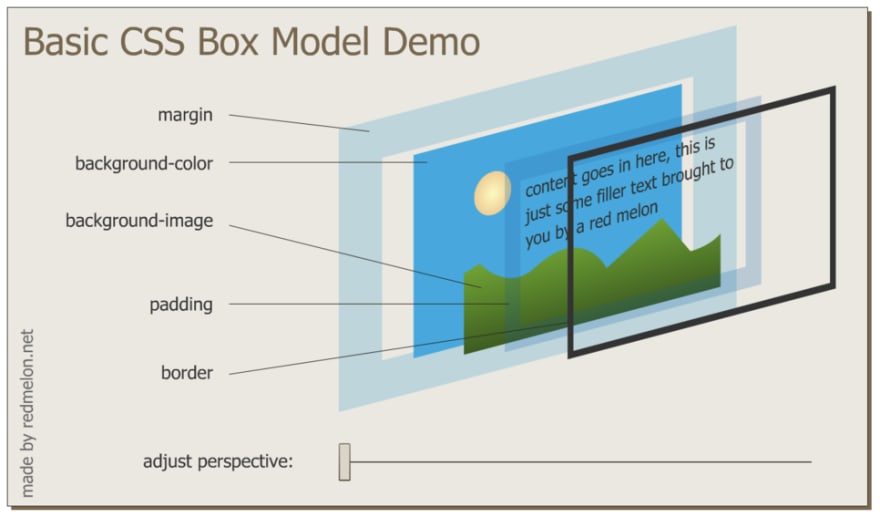
Box Model of Website Styling
Display Property
|
Display: Block /// take up entire line,
eg. <p>, <h1>, <div>, <ol>, <form>… Display: inline /// allow things to sit
to each other on the same line, eg. <span> <img> <a>… Display: inline-block
/// allow
things to sit to each other on the same line, while able to set the width of
each Display: none /// remove the element and
its position, vs. visibility: hidden only unshow the element while keep its
position |
Position Property
|
Position: static /// default style,
follow the natural html flow Position: relative /// relative to the
element’s position of the natural html flow, combining with other position
property, eg. left, top, bottom, right; it doesn’t affect the positions of following
elements Position: absolute /// relative to its
parent’s position, combining with other position property Position: fixed /// element stay at the
current position, eg. for top navigation bar |
Centering elements
|
text-align: center /// set inside the
parent block or container while the element doesn’t have a width setting, eg.
body margin: 0 auto 0
auto /// set
to the element itself, horizontal centered, margin: top right bottom left margin: 0 auto/// set to the element
itself, horizontal centered, margin: top&bottom left&right |
Font
|
<body> Font-family: A B C /// define the order of
preference of fonts </body>
<head> /// embedded font to
make sure the user can see the text in the fonts assigned. https://fonts.google.com/ <link rel="preconnect"
href="https://fonts.googleapis.com"> </head> |
Sizing
|
font-size: px /// px – static size font-size: 100% or 1em/// 1em = 100%=16px, at
medium web font setting, and no font-size setting in parent elements font-size: 1rem /// 1rem = 16px, at medium
web font setting, regardless if there is font-size setting in parent elements |
Float and Clear
|
img {/// as text wrapping in
Word float: left /// this will allow the
following text move to the right side of the picture } .text { clear: left /// as anti-float, this
will move the text to the left without wrapping to the picture } |
z-index
|
<div class = “top” style=”position: XXX , z-index: 1” ></div>
/// must
have a position setting that is not static <div class = “medium” style=”position: XXX , z-index: 0”
></div> /// 0 is the default value
of z-index <div class = “bottom” style=”position: XXX , z-index: -1”
></div> |
Media Query
|
@media print { … } /// when the page is being printed @media screen (max-width: 900px) { … } /// change the conditions
in the parentheses @media screen (max-width: 900px) and (min-width: 450px) { …
} /// use “and”
to set multiple conditions @media viewport {…} /// define the resolution |
Bootstrap
|
<head> /// method 1: link to the framework <link href="https://cdn.jsdelivr.net/npm/bootstrap@5.1.3/dist/css/bootstrap.min.css" rel="stylesheet" integrity="sha384-1BmE4kWBq78iYhFldvKuhfTAU6auU8tT94WrHftjDbrCEXSU1oBoqyl2QvZ6jIW3" crossorigin="anonymous"> </head> /// method 2: copy the starter template /// method 3: download CSS / JS code pack and set the link to the downloaded files |
bootstrap - container
<div class=”container-fluid”>/// fullwidth of the screen</div> <div class=”container”> /// will have margin around the container</div> |
Bootstrap – Navbar, push the link list to the right
end
|
<div class=”ms-auto”> /// margin-start auto, this will
push the link list eg. “contact”, “about us” to the right </div> |
Design Helping Websites
https://sneakpeekit.com/ https://balsamiq.com//// plan the structure of the website https://dribbble.com/ /// find the design ideas https://ui-patterns.com/ /// solutions for designing problems https://bootsnipp.com/ /// Design elements, playground and code snippets for Bootstrap |
Pesticide for Chrome: add-on to highlight the boxes
of elements on any webpage


